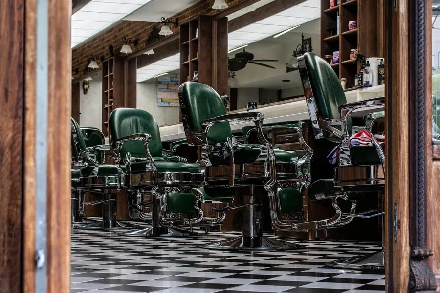
The Pharmacy Website That Turns Visits into Orders
For decades a pharmacy won the same way: be on the right corner, keep regular hours, and let footfall do the work. People came in for everything - the product, the price, the question they could only ask a pharmacist - because there was nowhere else to settle any of it. That arrangement quietly fell apart in the last few years. Customers now make most of the decision before they ever set foot outside: whether they will use you at all, whether you have the thing they need, whether it is worth the trip rather than a tap-and-deliver alternative. By the time they reach the door, the choosing is mostly done.
This is why a pharmacy website has stopped being a courtesy and become the place that decision gets made. Proximity still matters, but it no longer carries you on its own, because the moment of being picked has moved off the pavement and into a quiet screen the night before. The pharmacies pulling ahead across Switzerland and Italy are the ones that worked this out - they treat the site not as a digital leaflet but as the front counter’s first shift, open and useful long before anyone walks in.
The two questions every visitor arrives with
Strip away everything and almost every visit to a pharmacy website is one of two intents. The first is logistical and impatient: is it open, and where. The second is transactional and a little hopeful: do they have this, and can I get it without queuing. Get both answered fast and you have done eighty percent of the job. Bury them under a carousel of stock photos and a welcome message from the owner, and you have lost the visit.
This is the single biggest thing most pharmacy sites get wrong. They are built like a corporate homepage - mission, values, a smiling team behind soft focus - when they should be built like a service desk. The person on the other end is often unwell, often in a hurry, often on a phone with one hand while holding a child with the other. Clarity is not a design preference here. It is the whole product.
So the top of the page earns its place by answering those two questions before anything else. Open or closed, right now, in plain words. The address and a tap-to-call number. A search box or a clear path to the catalogue. The nearest on-duty pharmacy if you happen to be the one closed tonight. Everything else - the team, the history, the photos of the dispensary - is supporting cast that can wait until the visitor has what they came for.
Why a Google panel and a Facebook page will not carry you
Most pharmacists we talk to say a version of the same thing: “People find us on Google, we’re on the map, we post the holiday hours on Facebook - what more do I need?” It is a reasonable instinct, and the honest answer is that those tools are doing real work but a fraction of the job.
Your Google Business Profile is genuinely important - keep it accurate, keep the hours current, encourage reviews. But it is a rented panel. It shows a phone number and a map pin and a handful of photos, and that is the ceiling. There is no product catalogue inside it, no click & collect, no place for the article on managing seasonal allergies that brings in three hundred visitors every spring. It can point people at you. It cannot let them transact, and it cannot rank you for the hundred specific health questions your customers type every week.
Then there is social media, which solves a different and smaller problem. A Facebook or Instagram page is a fine noticeboard for a flu-jab clinic announcement or a change to the Easter hours, and older customers in particular do check it. But the platform owns the relationship and keeps moving the goalposts: its feed decides who sees the post, the post is gone in a day, and nobody reserves a course of treatment through a Story. Social announces. It does not put a prescription on the counter ready to collect.
The website is the one asset on this list that carries your name and not someone else’s. The look, the loading speed, the catalogue, the questions it answers, what happens the instant an order lands - all of it is yours to set. It keeps working at three in the morning when a parent is weighing whether a child’s fever can wait until eight, and it keeps working while every pharmacist on shift is heads-down at the dispensing bench. Best of all, a regulated business that already lives on thin margins keeps the whole of what the site earns: every reservation, every click & collect basket, with no platform clipping a percentage on the way through.
What belongs on a pharmacy website
Two flows decide whether a pharmacy site sinks or swims: finding the thing I need, and putting it aside for me without a fuss. Around that pair sits a short list of features that pull more weight in this trade than a designer would ever guess. Here is what earns its place.
Hours and on-duty schedule, front and centre
This is not a footer detail. For a pharmacy it is a headline feature, and it is one of the things people search for by name. “Open now” or “closed, opens at 8” stated plainly at the top, every day of the week laid out clearly, holiday hours flagged before the holiday. And the on-duty piece matters enormously: when you are the pharmacy on night or weekend duty, that page becomes a small public service, and the search traffic around “on-duty pharmacy tonight” is some of the most reliable you will ever see. When you are not on duty, pointing visitors to who is builds the kind of goodwill that brings them back to you on a normal Tuesday. A site that handles the duty rota well is a site people bookmark.
A product catalogue people can actually browse
People do not arrive wanting “products.” They arrive wanting cough syrup, a specific sun cream, baby formula, a thermometer, a supplement a doctor mentioned. The catalogue has to let them find that fast - searchable, sensibly categorised, with the things that actually move (cosmetics and dermo-cosmetics, supplements, baby and infant care, first aid, seasonal lines) easy to reach. You are not trying to be Amazon. You are trying to confirm “yes, we have this, and here is what it costs,” because that confirmation is what converts a search into a trip to your counter.
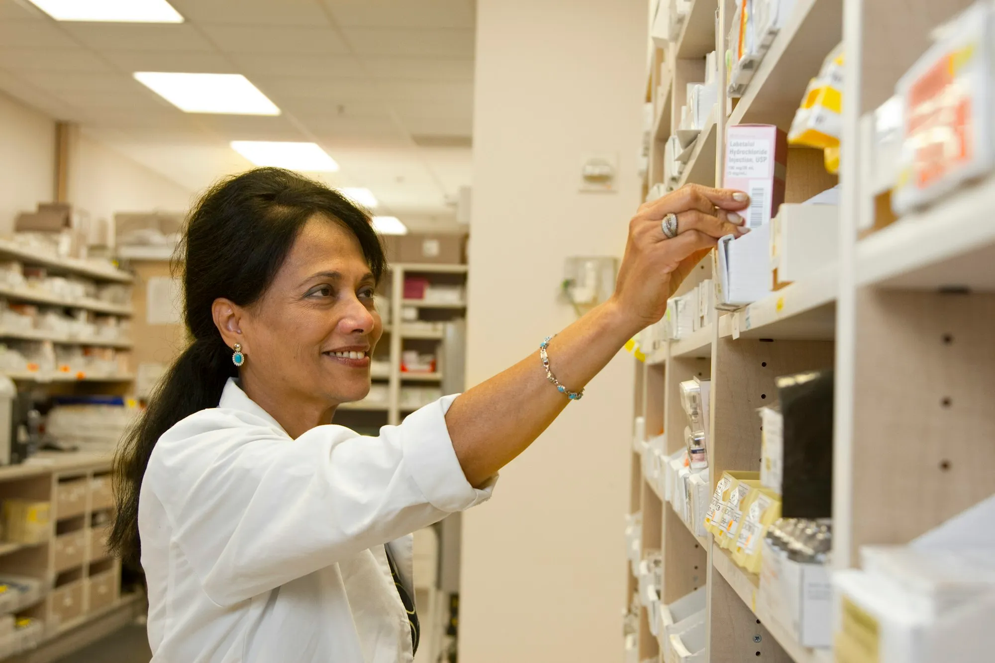
Click & collect, the order that brings a visit
Here is the heart of the whole site. Click & collect - reserve online, collect in store - is the single feature that turns a pharmacy website from a noticeboard into a revenue tool. A customer browsing at 8am picks what they need, places a reservation, and gets a “ready to collect” notice when your team has it set aside. No queue, no risk of a wasted trip, no “do you have it in stock” phone call.
What makes this so valuable for a pharmacy specifically is what happens after the reservation. The order is not the end of the sale - it is a booked visit from someone who is definitely coming in. They collect the paracetamol they reserved and, at the counter, your team adds the throat lozenges, answers the question about dosage, suggests the vitamin D for the winter. The reserved item is the hook; the counter conversation is where the basket grows. Pharmacies that treat click & collect as “a booked customer walking through the door” rather than “an online order” get far more out of it.
There is a regulatory shape to this that works in your favour. A pharmacy cannot, and should not, sell prescription-only medicine like a general retailer - but click & collect sidesteps the awkward part entirely, because the customer collects in person, where a qualified pharmacist can check, advise and hand over exactly as they would for a walk-in. The online step is reservation, not unsupervised sale. That keeps you firmly inside the rules while still giving the customer the convenience they expect from everything else they buy. It also lets you handle the things a faceless web shop never can: the parent who reserved a children’s fever syrup and needs the dose explained, the customer collecting a repeat item who should really book a medication review. The reservation gets them to the counter; your expertise does the rest.
Reading about these features is one thing; clicking through them is another, so we built a whole pharmacy to try: open the live demo. The pharmacy is invented, but nothing about it is mocked up - the catalogue search runs, the click & collect flow takes a real reservation, the hours and on-duty rota update, the services and advice pages all behave exactly as yours would.
Services, stated like appointments you can book
Modern pharmacies do far more than dispense. Vaccinations, blood pressure checks, prescription handling and renewals, medication reviews, minor health screenings, cholesterol or blood-sugar tests - these are reasons to come in, and most pharmacy sites either hide them or list them in a grey paragraph nobody reads. Give each service its own clear explanation: what it is, who it is for, whether you need an appointment, what it costs if relevant. A page that says “flu vaccination, no appointment needed, weekday mornings” sends people to your door. A vague “we offer various services” sends them to look elsewhere.
These service pages do double duty as search bait. People genuinely type “blood pressure check near me” and “where can I get a flu jab,” and a clear, honest page aimed at that exact phrase will quietly pull in visitors a general homepage never could. The trick is to write each one the way a customer would ask about it, not the way a clinical leaflet would describe it. “Can I just walk in for a blood pressure check?” is the question; “yes, any weekday before noon, no booking, takes five minutes” is the answer that wins the trip. Where a service does need a slot, let people request one in a tap rather than forcing a phone call during your busiest hour.
Health advice content, the quiet traffic engine
This is the feature pharmacy sites most often skip and most often regret skipping. Genuine, useful advice - how to manage hay fever season, what to keep in a family first-aid kit, how to read a sunscreen label, what to do for a child’s fever overnight, when a cough warrants seeing a doctor - does two things at once. It answers the questions your customers are already typing into a search bar, which brings them to your site instead of a competitor’s. And it does the thing a pharmacist does best in person: it builds trust through expertise. Written by, or signed off by, your actual pharmacists, this content is the most durable marketing asset you can own.
A small but important point for this trade: health content carries a duty of care that an ordinary marketing blog does not. The same name and qualification that builds trust also means the advice has to be sound, current and clearly the work of a professional - search engines increasingly reward exactly that kind of expert, accountable health content, and so do readers. A signed article that says “if symptoms persist beyond a few days, see your doctor” is doing its job honestly and ranking better for it. We will come back to why this channel is the main event for a pharmacy, because the economics of it are unlike anything paid advertising can offer.
Proof that you are real, regulated and human
A pharmacy is a place of trust before it is a shop, and the site has to carry that. A real team page with the pharmacists’ names and qualifications. Your licence and the fact that you are a regulated pharmacy, stated plainly. Honest reviews. Membership of the relevant professional body. These are not vanity items. When someone is deciding whether to take health advice from your article or reserve a product through your site, “a registered pharmacist, named, with a face” is the signal that closes the gap. Specifics beat slogans every time - “our pharmacists have a combined 40 years behind the counter” says more than any tagline about care.
Turning a visitor into a customer at the counter
The right pages get you to the starting line; they do not win the race. What separates a site that merely looks tidy from one that puts customers at your counter is a cluster of small things nobody bothers to sweat.
Phone speed is non-negotiable. Picture the actual visitor: on a phone, thumb-typing, feeling rotten, with zero patience to spare. If your homepage needs four seconds to show up, that person has already tapped back to the results and clicked the next pharmacy down the list - they were gone before your hero image even painted. So a page that loads in a blink, and works cleanly with one hand while the other holds a child or a tissue, is not a nicety you add later; it is the cost of being in the running at all. It is also the plainest argument against a bloated, plugin-stuffed build, which leaks exactly these customers, quietly, all day long.
Make the click & collect order effortless. This is the highest-value action on the whole site, so treat it that way. Fewer fields, plainer language, a clear “ready to collect” promise, no forced account creation for a simple reservation. Every extra step between “I want this” and “it’s reserved” is a place where a hurried, slightly unwell person gives up and phones the pharmacy down the road instead.
One obvious next step per page. A product page should push one thing: reserve it. A service page should push one thing: book or come in. A hay fever article should end with a gentle “the remedies that help are on our shelves - reserve and collect.” Not five competing buttons. One.
How fast you respond decides the sale. Few trades are this unforgiving about reply time. A reservation or a service enquiry that pings your team straight away, and has the item bagged and set aside inside the hour, turns into a visit. The same request left blinking until mid-afternoon turns into nothing, because the person was unwell and simply could not wait - they bought it somewhere else hours ago. Wire the site so each order lands in front of your team the moment it is placed, and work that queue the way you would a line of real people at the till, because that is what it is.
Put the reassurance where the hand hovers. A named, photographed pharmacist sitting alongside the advice. A “registered pharmacy” line a thumb’s reach from the reserve button. A review tucked under the services. The instinct to trust a reservation or a piece of health guidance fires when there is clearly a qualified person on the other side, not a blank form - and in a regulated trade, where the stakes are someone’s health, that instinct runs twice as strong.
There is nothing ingenious in any of this. It simply gets done carelessly almost everywhere, so the pharmacy that does it carefully pulls ahead by default.
Where your traffic comes from: local search and good advice
Sooner or later the question is “how do people find the site?” For a pharmacy the answer is unusually clear, because the economics of this trade point hard at two channels that cost little and last long.
Local search is the foundation, and it is mostly yours to win. When someone types “pharmacy near me,” “pharmacy open now,” or “on-duty pharmacy tonight,” the result is decided by proximity, an accurate Google Business Profile, real reviews, and a fast website with honest local content. None of that requires an ad budget. It requires getting the basics genuinely right and keeping your hours and on-duty schedule precise. A pharmacy that nails local search owns the most valuable real estate it has: the moment someone urgently needs exactly what you sell, a few streets away.
Health advice content is the long game that keeps paying. This is where a pharmacy has an advantage most local businesses can only envy. Your customers type health questions into search engines constantly - about allergies, sunburn, cold and flu, sleep, supplements, children’s fevers. Every one of those is a chance for your article to be the answer, with your reserve-and-collect button at the bottom. Write one solid piece on managing seasonal allergies and it earns visits every single spring, for years, at no recurring cost. That is the opposite of an ad, which earns nothing the moment you stop feeding it.
Paid traffic has a narrow, sensible role. Most prescription medicine advertising is tightly restricted by regulation, so the usual “run ads on everything” advice simply does not apply to a pharmacy - and that is fine, because you rarely need it. Where paid does work is small and specific: a modest local campaign around a new clinic or a flu-vaccination drive, or a seasonal nudge for a service you are allowed to promote, pointed straight at the relevant page. Beyond that, money spent on getting the website fast and the local signals right beats money spent on clicks almost every time. For this trade, organic is not just the cheaper option. It is the better one.
The pharmacy website: ready-made or bespoke?
So the site earns its keep. That leaves one practical question - how you actually get one - and for the typical pharmacy, ordering a build from scratch is the wrong place to begin.
Go bespoke and you sign up for a project counted in months and a bill counted in five figures, much of it spent watching a developer reinvent a product catalogue, a click & collect flow, an hours-and-rota module and a services layout that already exist, fully solved, dozens of times over. The delays are yours, the budget creep is yours, and the prize at the finish line is a piece of software you must now patch, secure and babysit yourself - which is a curious thing to take on when your actual job is running a dispensary. A few large chains with genuinely odd requirements truly need that road. The corner pharmacy almost never does.
The grown-up alternative is a productised pharmacy website: the entire thing already built and hardened across a long line of pharmacies before yours, then dressed unmistakably in your identity. Live in days rather than quarters. The cost is a fair one-off setup and a single flat monthly fee that swallows hosting, maintenance, security and the small tweaks you will inevitably want - and, the part that matters most to a trade counting every point of margin, not one centime of commission on the click & collect orders it sends you. Customisation does not go away: your brand, your colours, your catalogue, your advice articles, with room to bolt on bespoke pieces the day you outgrow the standard set. Think of it as a running start, not a set of handcuffs.
That is the reasoning behind our ready-made pharmacy website - one entry in a whole range of ready-made websites built trade by trade. What a custom project would eventually have handed you, you get now: a pharmacy that works, minus the months of waiting and the five-figure bet, ready to be taking click & collect orders by next week rather than next quarter.
Where to start
If a single instruction survives this article, let it be this: marry the click & collect flow to one genuinely useful piece of advice and grow out from that corner. Pharmacies tend to spend their effort polishing the part nobody visited for - the professional sheen - and starve the two levers that actually shift the numbers: a reservation so frictionless a feverish thumb completes it, and an article that already answers the question being typed. Get a fast, plainly regulated, phone-first site live, render your opening and on-duty hours impossible to misread, clear every order inside the hour, and you have built a quiet engine that walks people to your counter while you get on with the work you spent years training for.
Once, the genuine obstacle was getting any site built in the first place. That obstacle is gone. The pharmacy is built, it runs, and within days it can be carrying your name and taking your orders.
Frequently asked questions
- How much does a pharmacy website cost?
- A bespoke build runs into five figures and ties up months you do not have behind the counter. A ready-made, productised site like ours is a one-time setup plus a low all-inclusive monthly fee that covers hosting, maintenance, security and small changes - the current figure is on the solution page. There is no commission on the click & collect orders or reservations it generates; what the site earns, you keep.
- I have a Google profile and people already find the pharmacy. Do I need a website?
- A Google Business Profile gets you onto the map and shows your hours, and you should absolutely keep it sharp. But it is a single panel you do not own, with no room for a product catalogue, no click & collect, no advice articles, and no way to rank for the seasonal health questions people actually type. The profile points people at you; the website is where they reserve, read and decide to come in. The two work together.
- How long before the pharmacy website is online?
- A ready-made pharmacy website goes live in a few working days. We set up your brand, colours and content, connect your hours and on-duty schedule, and you load your first products and services from a simple dashboard. A custom project, by contrast, is usually a two to four month wait before anyone outside your meeting room sees a thing.
- Will click & collect actually bring people into the pharmacy?
- That is exactly what it is built to do. Someone searching at 8am for a product reserves it, gets a ready-to-collect notice, and walks in at lunch. The reservation is not the end of the sale - it is the start of a counter visit, where the average basket is bigger and your team can advise. Pharmacies that run it well treat the order as a booked appointment with a paying customer.
- Who keeps it updated, and do I need to be technical?
- You do not need to be technical, and you are not on your own. Updating a product, changing on-duty hours or publishing a seasonal advice note is done from a plain dashboard in minutes. Hosting, security patches, software updates and small changes are all included in the monthly fee. The whole point of a productised site is that the maintenance burden is ours, not yours.